Hi-Fructose • October 5, 2011 • by Marisa Ware

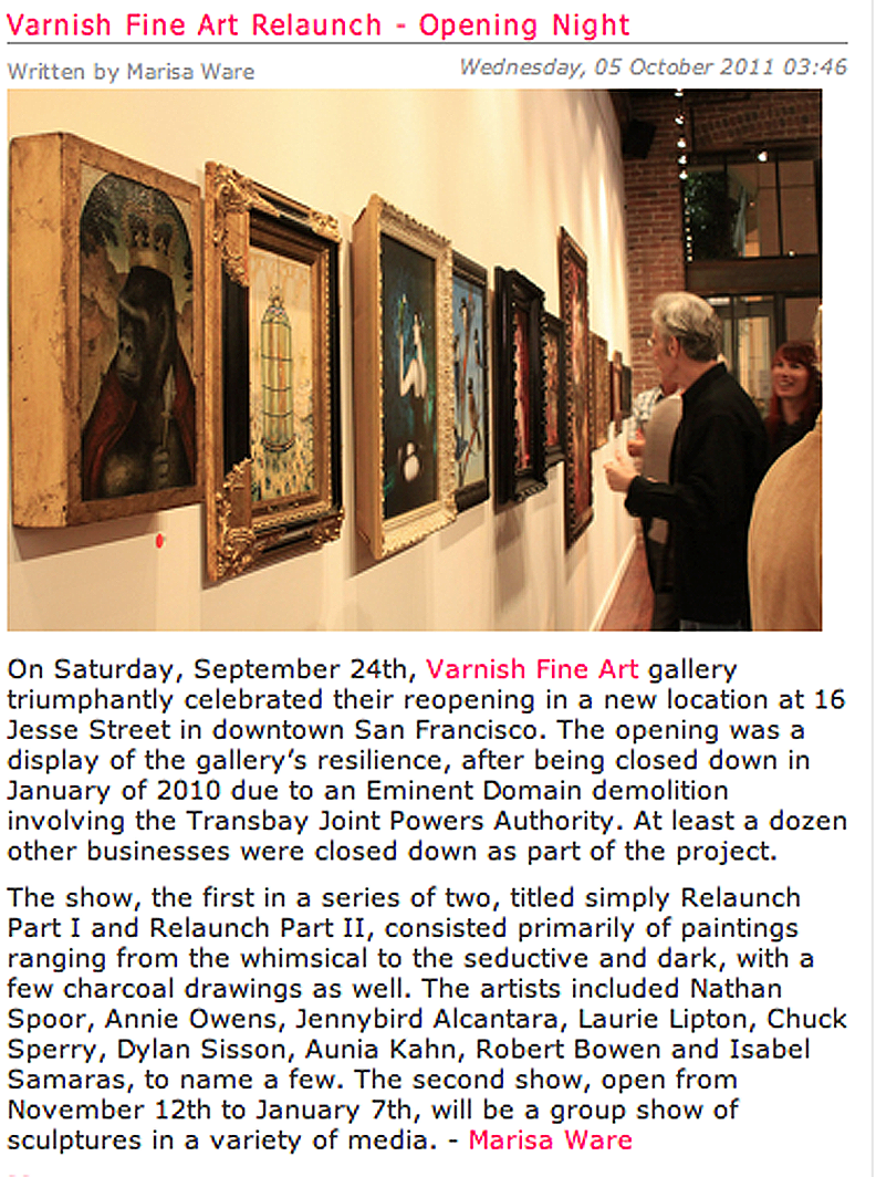
Hi-Fructose • October 5, 2011 • by Marisa Ware

I’m still riffing on the ideas that opened up when creating the SFMOMA Window Gallery installation. How to synthesize painting with silkscreen printing? What about a rock image makes a great painting? How can the processes of silkscreen printing, especially the layering effects, be brought off as a painting?
I brought some elements of the Window installation painting, “Saint Everyone,” to my new painting, “Heathen Child.” I’m working from a rock poster palette and from rock poster imagery. The Ginderman poster was the basis for the imagery of “Heathen Child,” but I wanted to take this in a new direction with materials and technique.
I used my circle patterns and carefully silkscreened a wide selection of patterns in different sizes in heavy metallic blue silver with green tinting on very delicate japanese printing paper. I was sure this would make a wonderful color for the background of the painting, layer nicely and become embedded in the surface of the canvas.
I laid a thick layer of cadmium red for the figure and flowers. This was modeled – shaded and highlighted – with many glazes of fluorescent red and orange to build up the surface and form. I brushed in shadows of cadmium and knocked those back with subsequent glaze layers of fluorescent. I needed the final edge color to be intense enough to eye-fry when the blue line was brushed on at the end. But wanted the shadow effects to translate in the finished art.
The lava forms were built up with fluorescent push-pull with cadmium, but the difference there was to build up a highlighted finish with pearl lustre. There is an pearlescent finish on the lava forms.
After the red areas were treated I put the background. Each circle was carefully cut out and then puzzled right to the edge of the red figure. I used gloss gel medium for under the paper surface and liquid gloss medium brushed over the paper surface.
Cobalt and permanent green for the foliage over the layered paper at the foreground.
Then when the brush and stars aligned – I finished the figure with blue eye-fry paint – first-stroke best stroke style – breathing deeply and making gestural strokes until it was finished with a very nice worked-in brush.
Like “Saint Everyone” – “Heathen Child” is a painting exploring direct religious experience in a psychedelic key of fluorescent, and perhaps a little more pagan or pantheistic in scope. Here’s some details (click to see larger):
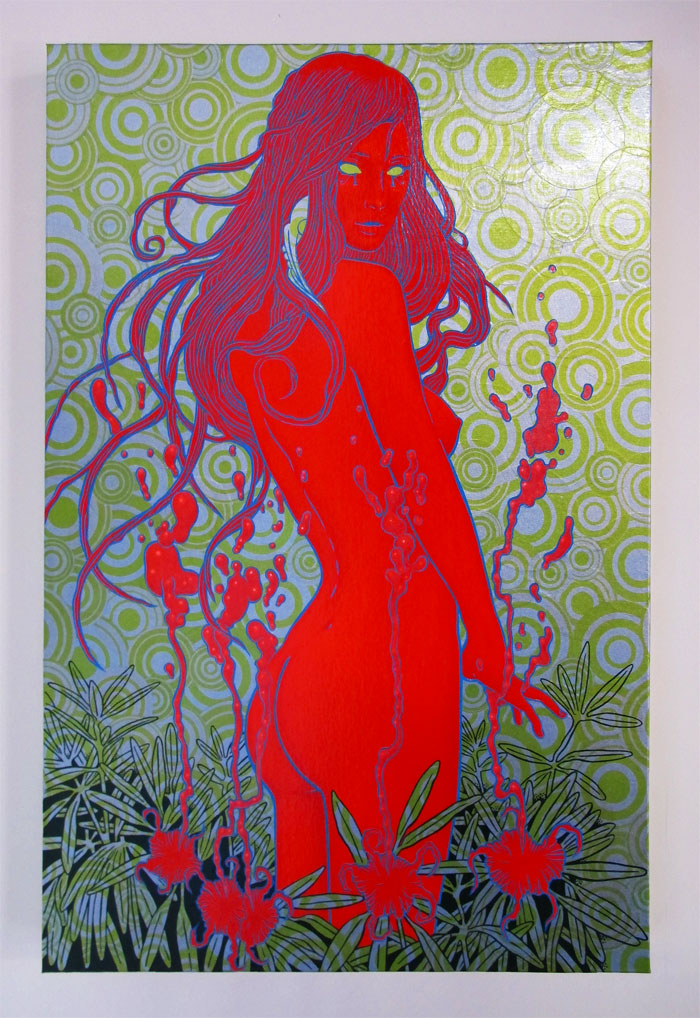
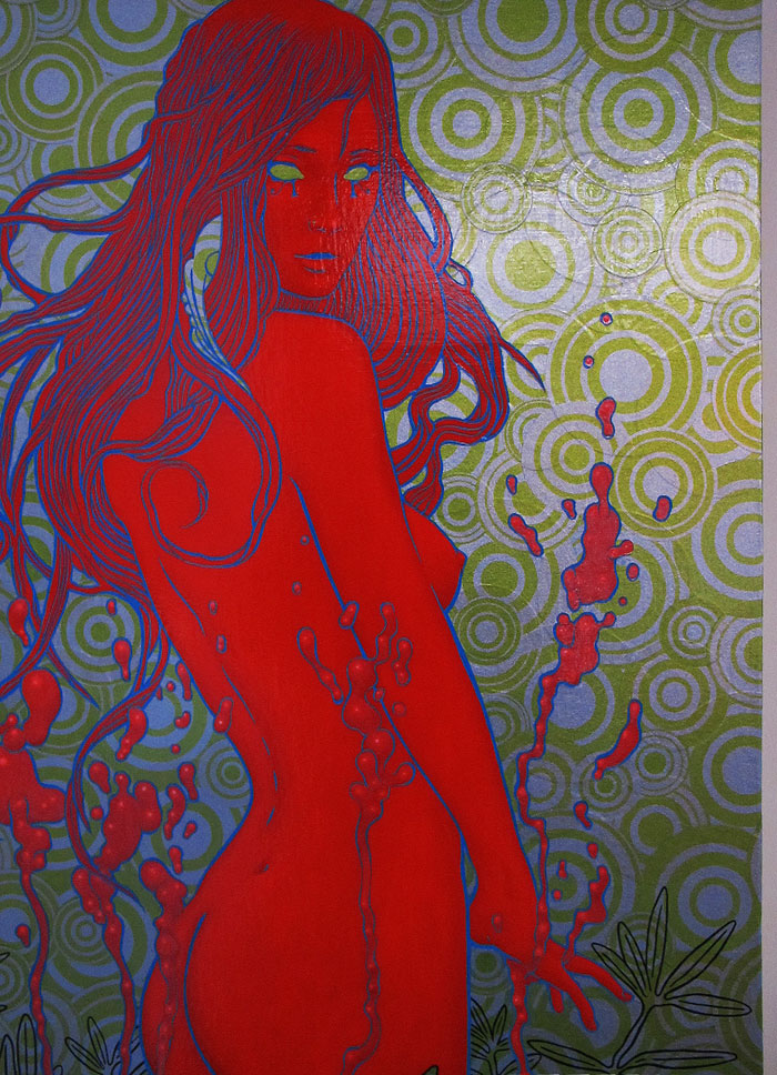
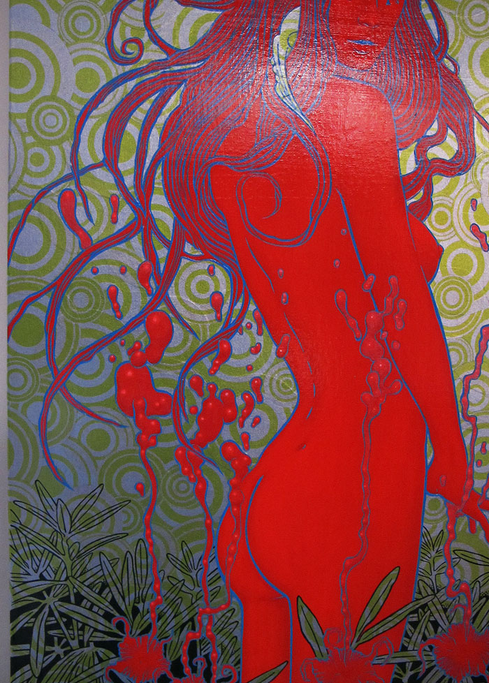
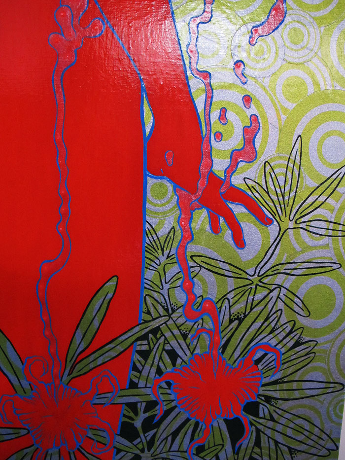
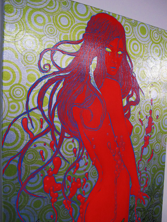
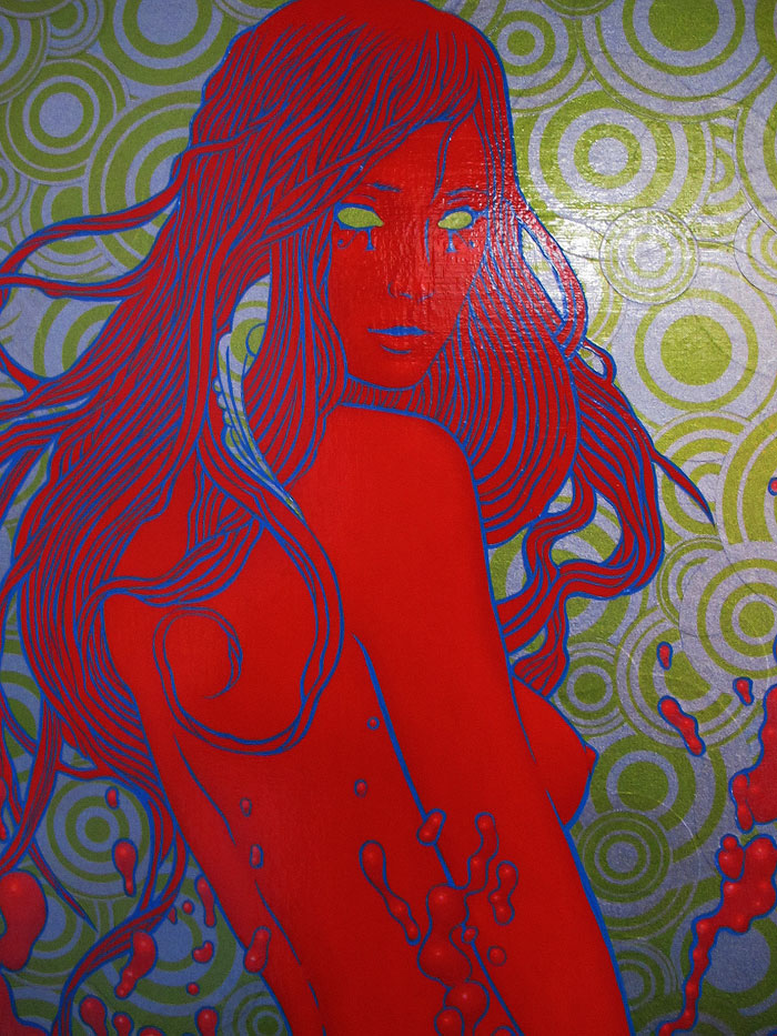
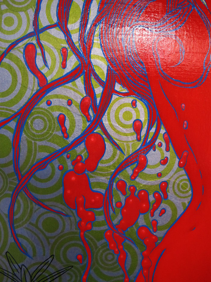
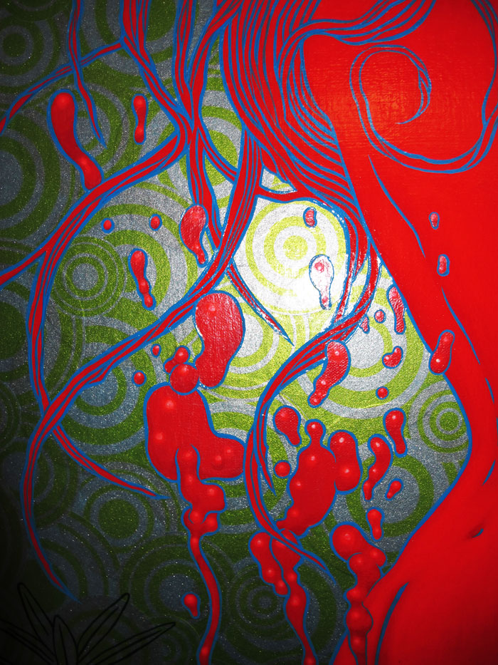

Heathen Child, 2011
Acrylic and applique on canvas
24 x 26
______________________
Heathen Child is available through Varnish Fine Art Gallery, 16 Jesse Street, San Francisco.
I’m really happy to see Jen Rogers and Kerri Stephens have brought Varnish Fine Art back to life and have such cool new digs for shows!
Varnish Fine Art Relaunch Part I
September 24 – through – November 5, 2011
group show with: Chris Mars, Robert Williams, Jennybird Alcantara, Laurie Lipton, Isabel Samaris, Scott Musgrove, Annie Owens, Craig LaRotonda, Nathan Spoor, Chuck Sperry, Kevin Peterson, Beth Bojarski, Edith Lebeau, Aunia Kahn, Ciou, Robert Bowen, Sri Zeno Whipple, Winston Smith, Kevin Evans, Dylan Sisson, Skot Olsen

Temporally Bound (Three Gorgons): An installation by Chris Shaw & Chuck Sperry
June 2011 to January 2012
SFMOMA Window Gallery, Natoma Street, SF
Acrylic on 3 sections of 6 articulated hard-panels.
Each section measures 6’8″ x 12′ installed. (6’8″ h x 18′ flat.)
Chris Shaw and Chuck Sperry have been close friends for many years, but have only worked in tandem creating art on a handful of occasions. Both artists have both incorporated and appropriated concepts and imagery from a myriad of sources in their designs for Rock Posters and paintings.
“Temporally Bound” marks this collaboration by the two artists not only as an event, but also in the form and subject of the artwork. The work’s form is derived from an asian “accordion” book, while the subject, “Three Gorgons” reflects the artists’ western influences. The free intertwining of Eastern and Western references is not only evocative of the modern technological world, but also of San Francisco, a cultural melting pot on the Pacific Rim.
The installation is composed of 3 sections of 6 articulated hard panels, painted in acrylic and hand-made paints. The articulated form allows the artwork to bend or compress, the which lets the artwork take almost any form, in 2 or 3 dimensional space. Sperry and Shaw’s design concept for the Natoma Street windows of the SFMOMA Window Gallery called for an 18 foot wide horizontal image to compress into a 12 foot wide area. The artists chose wooden hard-panels for the installation substrate which creates a sturdy self-supporting structure with 52º angles, a golden proportion harmonious to the installation space.
In their experiences in creating Rock Posters, Shaw and Sperry had both worked previously with multi-panel poster images. When composing the “Three Gorgons” the artists paid special attention to the way the images would fragment when the panels were in their compressed and folded state. Because many of the viewers passing the installation on the sidewalk would be approaching at very oblique angles, the artists created semi-symmetrical images that would appear to change and unfold as the viewer passed by. Viewing the art at oblique angles and close proximity creates a distinct sense of “false abstraction”, while viewing the pieces from afar (the opposite sidewalk) gives the viewer cohesive, representational images of the Three Gorgons.
The 3 Gorgon images were created to work individually or together as a unit. In tandem, the artists each created their own distinct versions of a Gorgon (Shaw,left / Sperry, right). While each artist created their compositions and selected color individually, certain decisions were made together to help enhance the overall artwork when viewed in a unit. Red and Gold were both chosen as main color components, which again references Eastern art. The overall bold colors and hard graphic blackline of the Gorgons additionally reflects the artists work as poster artists and printmakers. Sperry and Shaw then worked together to create the 3rd, center Gorgon, a “hybrid” of their styles that would further bridge and integrate their individually created Gorgon panels.

Sperry’s highly textured Gorgon (right panel) evokes the paintings of Vienna Secession, primarily the work of Gustav Klimt, who is an influence in Sperry’s use of metallic pigments and textured layerings of paint. Sperry’s Gorgon offers a dynamic manifest investigation in painting of the styles and themes of the poster tradition.

The center, “hybrid” Gorgon as a co-creation is a melding of the 2 artists ideas and styles. Shaw’s subtly rendered mother-of-pearl Gorgon’s face is accented with copper and black metal-flake paints. Sperry created the Gorgon’s prerequisite head of snakes, combining gold serpentine forms with linear rays of silver and copper. The two components of the image are seamlessly integrated with a bold blackline, characteristic of both artists’ work. This piece will also produce the optical illusion mentioned above as the viewer passes the artwork on the sidewalk.

Shaw’s Gorgon (left section) is a hard-line and sharp shadowed, woman’s face in pure yellow with pupil-less red metallic eyes. The Gorgon is accentuated by a headful of stylized gold snakes based on a pre-Inca Moche headdress. The symmetry in the face and forced perspective creates a distinct “Holbeinesque” optical illusion when viewed in the folded 52º state, as the face will appear to rotate as the viewer passes. Shaw’s work with large-scale stage art fostered an interest in the way large images can change when viewed at very oblique angles.


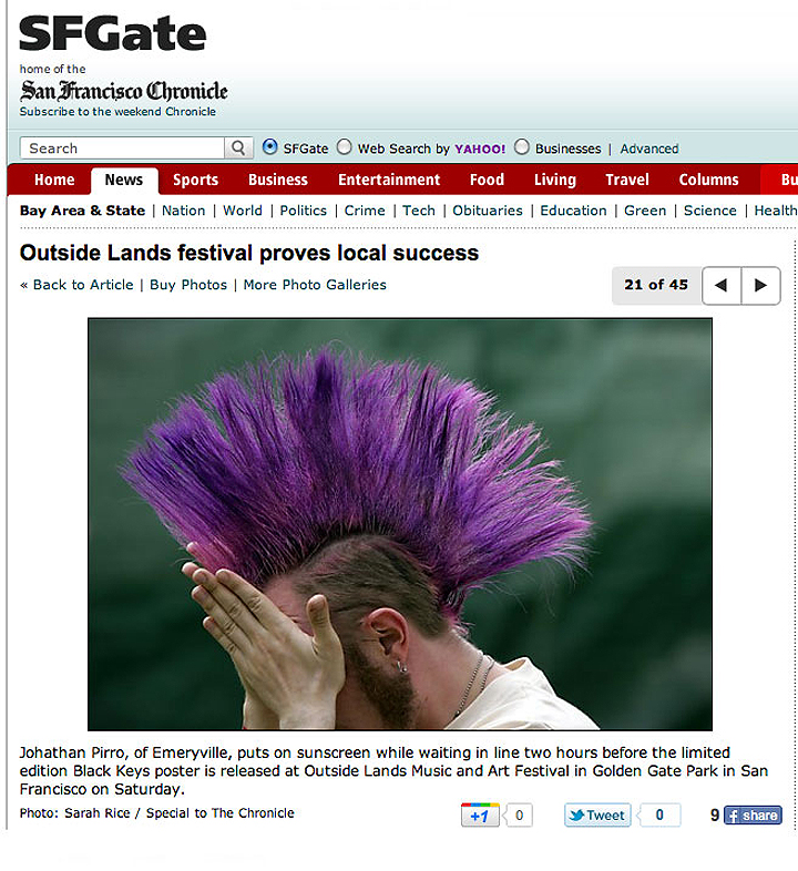
San Francisco Chronicle • SFGATE • August 14, 2011 • Photo: Sarah Rice

Saint Everyone, 2011
11 feet by 9 feet
Acrylic and Silkscreen Appliqué on Canvas
I installed my 11 foot by 9 foot acrylic painting, “Saint Everyone,” at the San Francisco Museum of Modern Art yesterday. It will be on view at the SFMOMA’s Artists Gallery Windows on Minna Street from June 2011 through January 2012. There are florescent lights which are timed to go on at dusk until 2 am.

My large scale painting, “Saint Everyone” is figurative, a postmodern pastiche of Pop, Op and Rock Art. Its theme is inspired from the very recent spontaneous popular movements which have swept the world since January 2011. My iconic figure holds a lotus, it’s unfolding petals suggest the expansion of the soul. The growth of its pure beauty springs from the fertile mud of its origin and grows into a benign spiritual promise. The figure is a loose appropriation and is re-imagined by the artist from a rock poster created by The Big Five (Mouse, Wilson, Griffin, Kelley, and Moscoso) for the 20th anniversary of the Summer of Love in 1987. The Summer of Love in 1967 is the San Francisco analog of the change that is sweeping the world in 2011. This image was originally used on a poster I designed and printed for “American Artifact, The Rise of American Rock Art,” directed by Merle Becker. Appliqué disks employ elements of Op Art, inspired as they are from the work of Martin Sharpe, the British psychedelic artist. They are produced via silkscreen and applied – like a poster would on the street – in rhythmic patternization. The disks suggest decentralization or cell structure. I wanted to combine acrylic painting and silkscreen techniques in a seamless composition, and “Saint Everyone” is the result.
This painting was a year in planning and six weeks in execution. Renée de Cossio curated the project which involves me, Chris Shaw and Ron Donovan. Renee has been a constant source of support and inspiration and I thank her and the San Francisco Museum of Modern Art for making this show happen.
Make sure to check the websites of my collaborating artist friends Chris Shaw and Ron Donovan to see their paintings and art work. They will be posting pictures and more very soon!
The six weeks spent working in this resulted in scores of paint layers, many in florescent acrylic, silkscreen and painting processes. There are certainly at least 30 layers of paint on this and the depth shows. The red blue chroma literally stopped traffic yesterday when Chris Shaw and I were hanging these – someone driving down Minna Street actually skidded to a stop to look at our paintings and ask our names.
I have several process videos of the painting in progress. The first is a short montage of photos I took throughout the process:
Below are some of the more photogenic processes in timelapse. First, removing a mask I cut with an exacto knife to paint the gold Op Art patterns that surround the figure:
Next, I’m printing the appliqué optical patterns on very nice Japanese rice paper that resonates with and continues the motif painted in gold:
Here’s a timelapse video of me applying the rice paper op patterns to the canvas with gel medium under and gloss medium over to fully embed the rice paper to the painting surface:
Finally here are some beautiful photographs taken by my friend Stephen Abramson of the final reactive blue color getting layed down. Click to see larger:


 Chuck Sperry lives in the Haight-Ashbury district of San Francisco, where he’s made his particular style of rock poster designs for over 20 years. He operates Hangar 18, a silkscreen print studio, located in Oakland. Learn More…
You must be logged in to post a comment.