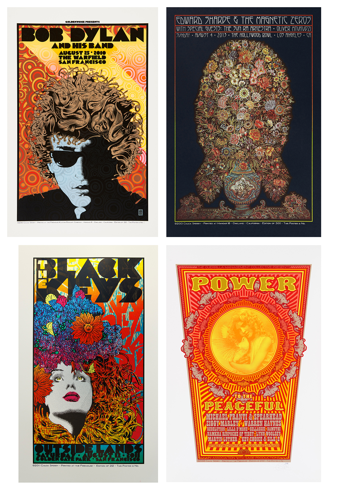
Clockwise from top left: Bob Dylan, Edward Sharpe & the Magnetic Zeros,
The Black Keys and Power to the Peaceful by Chuck Sperry
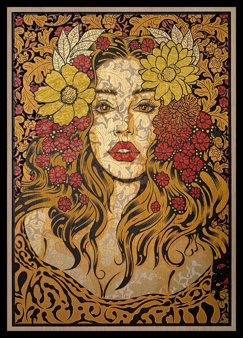
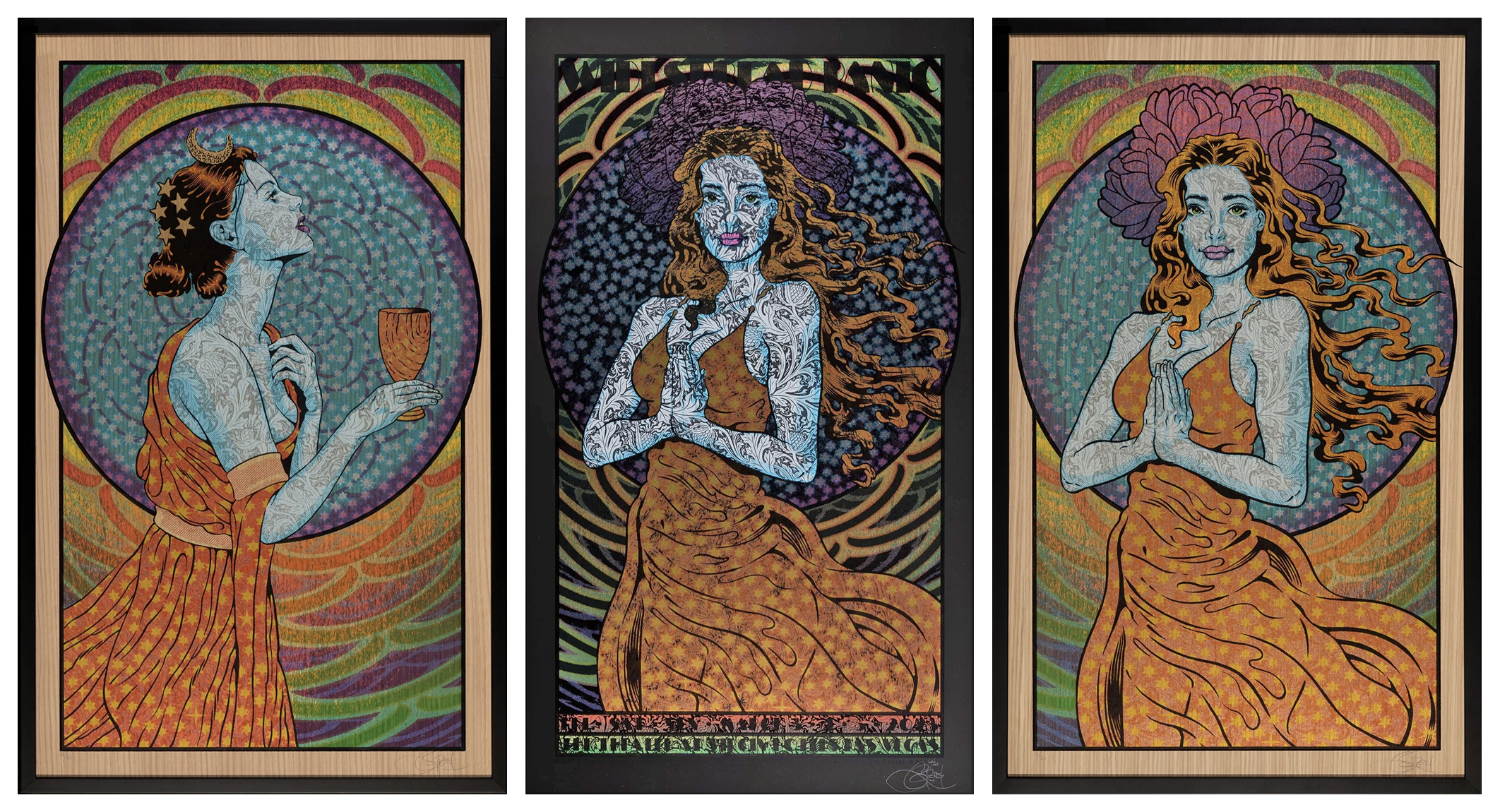
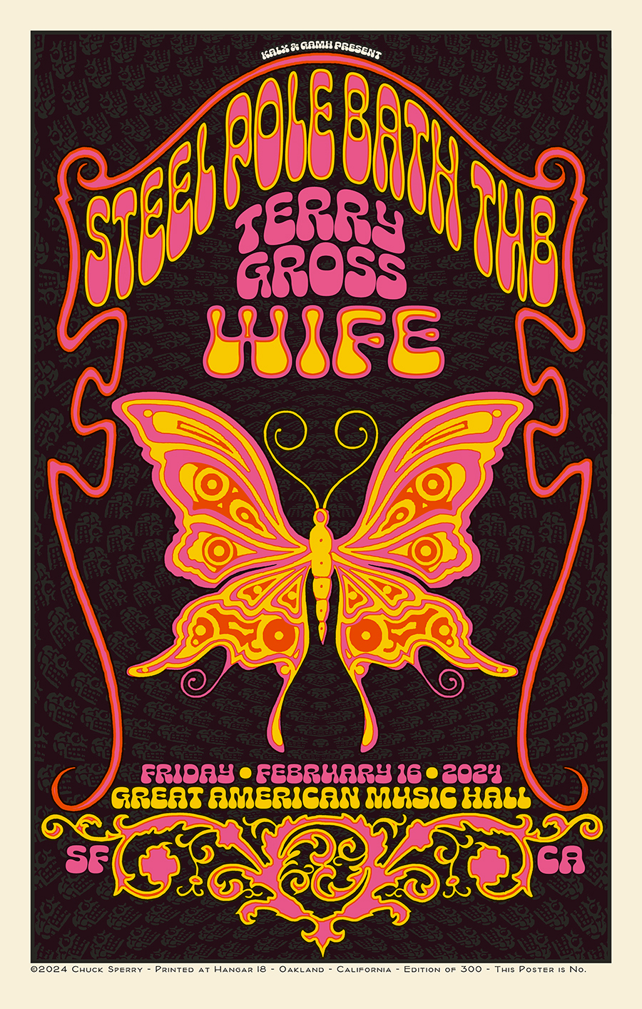
I’m very proud to announce that San Francisco Museum of Modern Art has acquired a selection of my concert posters for its permanent collection. The museum will include my work in its upcoming exhibition Art of Noise opening May 4, 2024. This exhibit should not be missed! It is a must-visit for every poster fan, all my friends, and supporters!
Here, briefly what the museum says about the exhibition:
Music is amplified by great design, from the concert posters that paper bedroom walls to the Sony Walkmans and Apple iPods once carried in our pockets. Through over 800 works, Art of Noise explores this essential relationship and the ground-breaking designs that enrich our collective memory, touching all our lives and giving form and color to sound. Heavily drawn from SFMOMA’s collection, the works on view include over 500 concert posters and flyers, 150 record album covers, 100 design objects, and three sound installations that chart the evolution of music-centered design over the past 100 years. Enter the exhibition’s “temple” to music graphics where hundreds of psychedelic rock posters extend from floor to ceiling, highlighting San Francisco’s integral role in the 1960s and ‘70s scene and the artwork that turned it up.
You can learn more about this amazing exhibition by following the link below.
Art of Noise is organized by SFMOMA and curated by Joseph Becker, associate curator of architecture and design, with Divya Saraf, curatorial assistant in architecture and design.
Art of Noise • May 4 – August 18, 2024
San Francisco Museum of Modern Art
151 Third Street • San Francisco, CA 94103

You must be logged in to post a comment.