“Heathen Child” Painting

On September 27, 2011, in Art Events, by squirt

Heathen Child painting by Chuck Sperry, 2011

I’m still riffing on the ideas that opened up when creating the SFMOMA Window Gallery installation. How to synthesize painting with silkscreen printing? What about a rock image makes a great painting? How can the processes of silkscreen printing, especially the layering effects, be brought off as a painting?

I brought some elements of the Window installation painting, “Saint Everyone,” to my new painting, “Heathen Child.” I’m working from a rock poster palette and from rock poster imagery. The Ginderman poster was the basis for the imagery of “Heathen Child,” but I wanted to take this in a new direction with materials and technique.

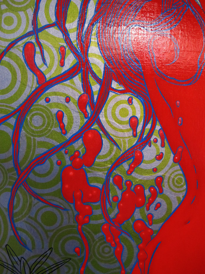
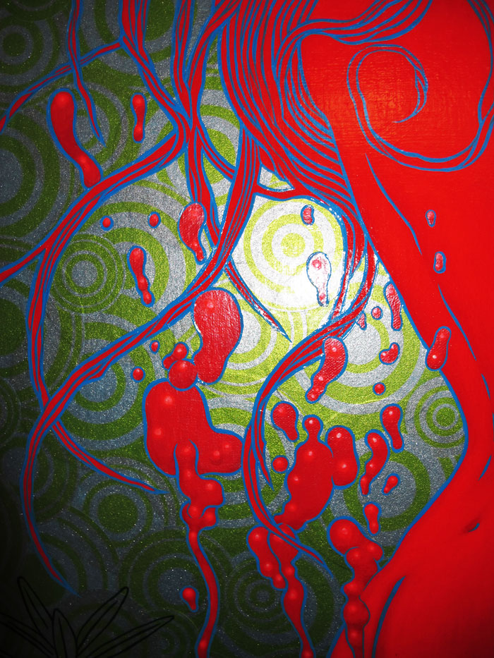
I used my circle patterns and carefully silkscreened a wide selection of patterns in different sizes in heavy metallic blue silver with green tinting on very delicate japanese printing paper. I was sure this would make a wonderful color for the background of the painting, layer nicely and become embedded in the surface of the canvas.

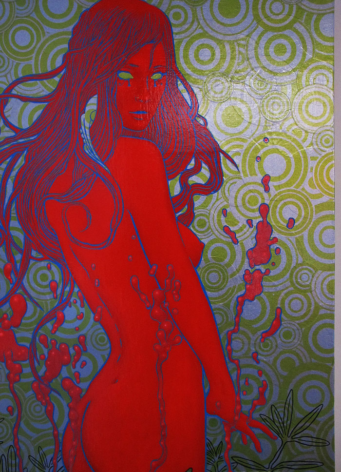
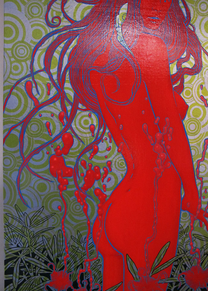
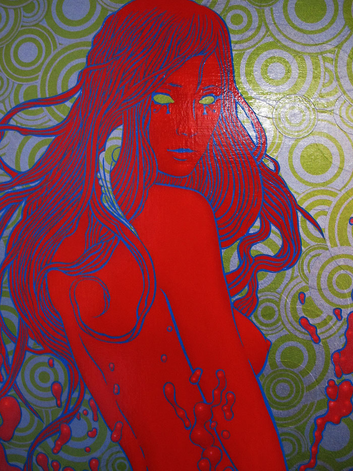
I laid a thick layer of cadmium red for the figure and flowers. This was modeled – shaded and highlighted – with many glazes of fluorescent red and orange to build up the surface and form. I brushed in shadows of cadmium and knocked those back with subsequent glaze layers of fluorescent. I needed the final edge color to be intense enough to eye-fry when the blue line was brushed on at the end. But wanted the shadow effects to translate in the finished art.

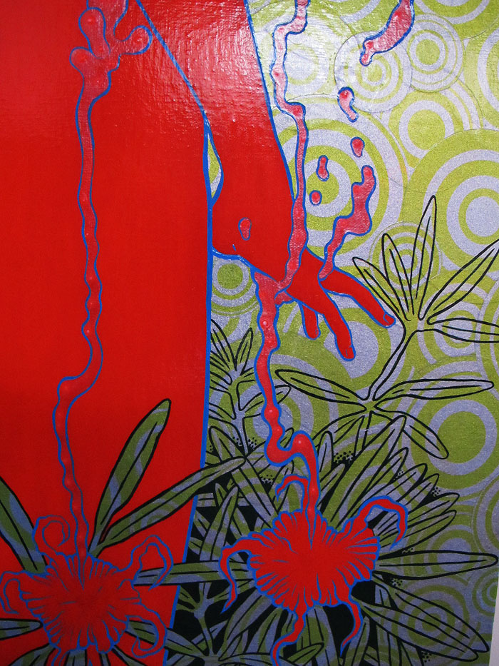
The lava forms were built up with fluorescent push-pull with cadmium, but the difference there was to build up a highlighted finish with pearl lustre. There is an pearlescent finish on the lava forms.

After the red areas were treated I put the background. Each circle was carefully cut out and then puzzled right to the edge of the red figure. I used gloss gel medium for under the paper surface and liquid gloss medium brushed over the paper surface.

Cobalt and permanent green for the foliage over the layered paper at the foreground.

Then when the brush and stars aligned – I finished the figure with blue eye-fry paint – first-stroke best stroke style – breathing deeply and making gestural strokes until it was finished with a very nice worked-in brush.

Like “Saint Everyone” – “Heathen Child” is a painting exploring direct religious experience in a psychedelic key of fluorescent, and perhaps a little more pagan or pantheistic in scope. Here’s some details (click to see larger):
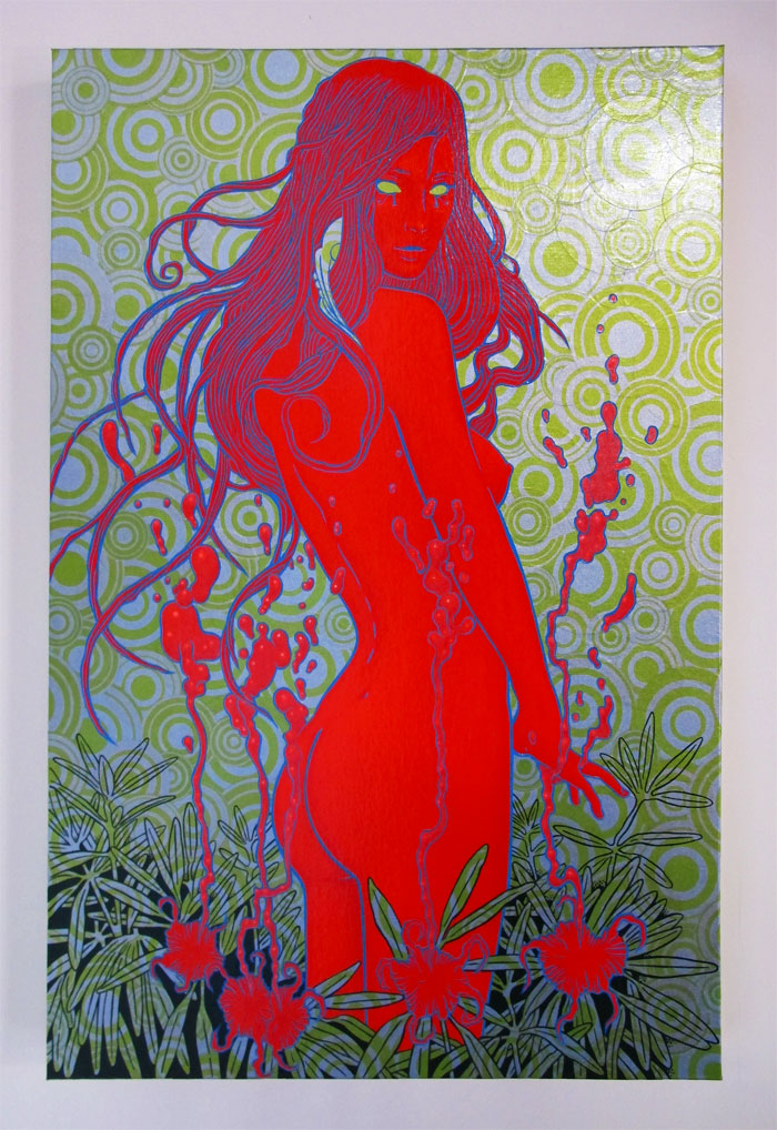
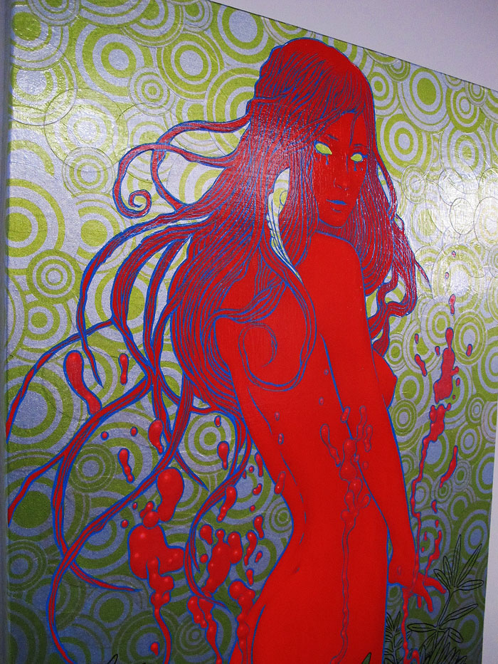
Heathen Child, 2011

Acrylic and applique on canvas

24 x 26

______________________

Heathen Child is available through Varnish Fine Art Gallery, 16 Jesse Street, San Francisco.

I’m really happy to see Jen Rogers and Kerri Stephens have brought Varnish Fine Art back to life and have such cool new digs for shows!

Varnish Fine Art Relaunch Part I

September 24 – through – November 5, 2011

group show with: Chris Mars, Robert Williams, Jennybird Alcantara, Laurie Lipton, Isabel Samaris, Scott Musgrove, Annie Owens, Craig LaRotonda, Nathan Spoor, Chuck Sperry, Kevin Peterson, Beth Bojarski, Edith Lebeau, Aunia Kahn, Ciou, Robert Bowen, Sri Zeno Whipple, Winston Smith, Kevin Evans, Dylan Sisson, Skot Olsen


Share

Widespread Panic invited me to make their 25th Anniversary Tour Fall Tour 2011 poster; the band needed an edition of 2000 to cover over 30 dates. I thought of Geraldine and The Honey Bee. Widespread Panic is like the life-giving flower and the fans stop to listen and feed from the beautiful experience. The concept was set, but making 2000? It seemed a tall order. The band was a bit apologetic, but there were those 30 dates, and the Spring tour poster sold out quite fast. So we thought let’s just give it a try.

In doing so many posters – I didn’t want to compromise: I didn’t want to plate sign these – so I hand signed and numbered each one. I didn’t want to use fewer colors. I wanted to continue to experiment with cool inks. I designed this in 7 colors on archival cream paper. Gold and silver metallics underlay the design with shimmering goodness (four and a half gallons of silver and two gallons of gold to complete 2000 posters). Four tinting colors fill in the spectrum. The last color (printed over the black) is a special mix of opalescent, pearlescent and interference blue on the translucent wings. So I’ve been as busy as a bee this last month, and the Firehouse was a hive of activity.

Widespread Panic 25th Anniversary Fall Tour 2011

16 x 29

Edition of 2000

7 color silkscreen (metallics, glazes and translucent tinting colors)

Printed on archival cream paper

Signed and Numbered

Poster will be made available by Widespread Panic during their tour.

I will be making a very limited release of Artist Proofs and variants after the tour.

Geraldine, chrysanthemine
Prettiest little flower that I ever seen
She’s a friend of mine, she’s a friend of mine.
Petal child, growin’ wild and
Even though she’s livin’ in a compost pile
She’s my glitter and my gold

Whoa Geraldine, have you forgotten?
Baby I have come for your sweet pollen.

I can’t wait to pollenate
Come on pretty baby let’s celebrate
Warm and livin’
The takin’ and a-givin’
Whoa … my my my

Love you high, sting you low
Buzzin’ everywhere that you let me go
Go my way, mama let me go my way.

Whoa Geraldine, have you forgotten?
Baby I have come for your sweet pollen.

I might go gray, I might go blind
I’m never goin’ back to that honeysuckle vine
Long as your alive, I’ll buzz around your hive.

Geraldine, chrysanthemine
Prettiest little flower that I’ve ever seen.
She’s my honeydew baby
Honey do me again
Oh-ho

Share
Tagged with:  

Humanity – Art Print Release – LA vs. War

On September 7, 2011, in Art Prints, by squirt

Humanity

Edition of 50

6 colors on archival cream paper

22 x 33

Signed and Numbered

———–

My favorite revolutionary political posters are from the Cuban Golden Age of political graphics from the late 1960′s and early 1970′s. There is a colorful fusion of psychedelia and political message. I did this poster in the spirit of clear, bold, direct communication.

I wanted to communicate the “visible” world and the “hidden” world that everything in objective reality depends on. Like the world of “ideas” and the world of “objects.” Or the world of spirit and the world of life. The individual struggle and the human struggle.

It’s a sort of yin yang idea….

There’s this greater submerged “underground” reality – it is larger – breaks over the bounds of the poster. It could represent spirit or humanity. The above ground living flower is represented as transitory (it is losing petals in the wind) - but it’s roots go down from the heart to the heart of the submerged reality – where it is fed – and eternal.

The hard part was to show something this complicated in a simple and pleasing graphic.

———–

I will be making a very limited release of this poster online through the Varnish Fine Art Emporium on Wednesday, September 14, 2011 at a random time.


Share
Page 1 of 212